clip-path : An Awesome CSS Property You Should Be Using
Hey friend! You must have heard of the clip-path property in css. No? Then you might be in for a treat. If yes wouldn’t you agree that it’s quite awesome and I would assume you landed here wondering where you could use it in your application. Here I’ll give a few use-cases with examples that would help you get started with using clip-path property in your application and the rest you can easily figure out.
The
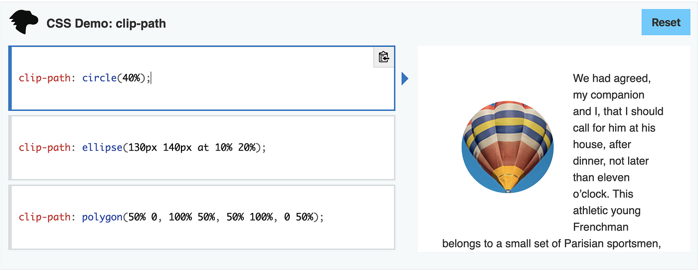
clip-pathCSS property creates a clipping region that sets what part of an element should be shown. Parts that are inside the region are shown, while those outside are hidden.
By the definition you must be wondering it must be used for clipping images. Yup you could definitely clip the images using the clip-path property and I think most probably people have been using it as an alternative to using border-radius property to make circular images like that in avatars.
But you could do a lot more!
<clipPath>

With <clipPath/> you can define a custom path for applying the clip-path property. So yeah we can do a lot more than circles and polygons with it.

Card

If you have used dribbble, you’ve seen the hover effect where you see the buttons on the cards when you hover on them. You can achieve the similar effect with clip-path by using the inset property.

Hence it can be used as an alternative to the translate property. A different way of animating in HTML isn’t it?
Ripple
Do you remember the ripple effect in buttons that had all the hype back some years ago. That can be easily achieved by using clip-path property.

Just add a transition of clip-path property with circle value changing from 0% to 100% on hover event and you could achieve it easily without breaking a sweat.

Floating Action Button

This is something I saw on the internet being used as an application of the clip-path property and found quite interactive which can be achieved the same way the ripple effect was carried out.
Polygons

By now it must have been obvious to you that you can define custom shapes as values to the clip-path property. But writing custom polygons is hard so you could use online tools to define the polygon instead of spending hours trying to set values to write the polygon. Here’s one that you could use:
There are numerous properties in CSS that we might be unaware of and this is just my take on how we could use one of them.
Hope it helped you think of other ways you could use clip-path property in your application or how you could integrate one of my examples in it.
That’s all for now folks. Keep on dreaming! :)
